How to Enhance the Ecommerce Customer Experience
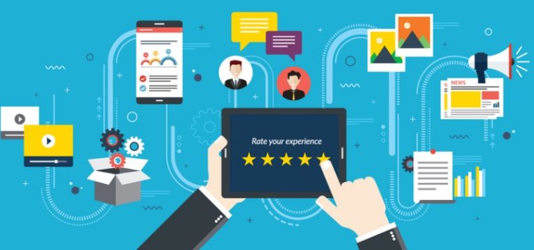
Up until recently, shopping was purely transactional. A merchant had a product a consumer wanted. The consumer purchased that product from the merchant and went on their way.
Interaction = complete.
But over the past couple decades, shopping stopped being this singular moment. It turned into a series of interactions between the retailer and the consumer. And it started well before the consumer even intended to buy anything.
Not only that, there was a noticeable power shift. The retailer still had a product the shopper wanted. But now the shopper had a whole slew of other retailers to choose from. It wasn’t enough for the retailer just to have the product. They had to prove why the shopper should choose them over everyone else.
This is when shopping transformed from transactional to experiential.
Since the early 2000s, online sellers have begun to prioritize customer satisfaction less and customer experience more. And I’m not just throwing that claim out there with zero evidence. Take a look at Google Trends search data for “customer satisfaction” v. “customer experience”:
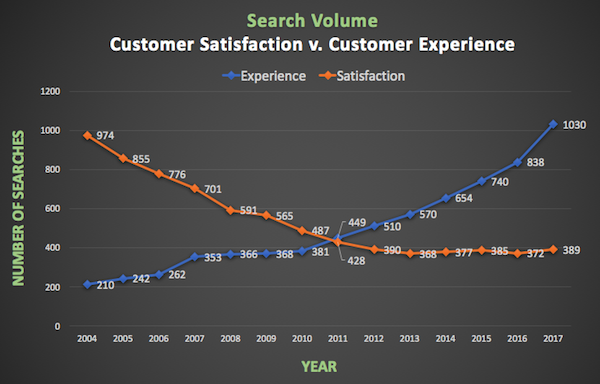
Those are some pretty steep curves.
The challenge is that satisfaction is easy to understand. It’s just a matter of meeting someone’s needs. Offering an experience, though? That’s a little more abstract.
Defining the Ecommerce Customer Experience
Each communication a consumer has with your brand influences the ecommerce customer experience. It’s affected by every touchpoint — including the times you start the conversation and when they reach out to you. Any interaction the consumer has with you, your team, your website, social media, or marketing is a part of the customer experience.
Think about it this way. Satisfying a shopper’s needs means they won’t leave you a negative review. But providing an experience is what inspires a shopper to tell their friends about you.
The quality of the ecommerce customer experience has a direct impact on customer loyalty. You must take advantage of every opportunity to prove your dedication to your customers and their happiness.
So how do you show this dedication? By being just this side of obsessed with each of the elements below.
Website Design

What kinds of words would first-time visitors use to describe your website? Are the phrases “user-friendly”, “helpful”, and “convenient” (or some variation) in that list? If not, you’ve got a problem.
Your Homepage
Think about what makes your brand special. Are your products 100% organic or handmade? Do you offer free or flat-rate shipping on all orders? Are you a family business with a long history? Showcase everything that helps you stand out from the competition on your homepage. You want to communicate quality and trustworthiness right off the bat.
In addition, shoppers shouldn’t have to scour your site to find contact information. Because if they can’t easily get in touch, a minor issue or simple question could end up being the (totally avoidable) reason they abandon their cart.
Product Pages
Product pages need more than the item name, price, and a single low-res photo. Frankly, that’s not even the bare minimum; it’s woefully insufficient. Each product page should have a thorough description and multiple, high-quality photos.
Consumers shouldn’t have to cross their fingers and hope what they’re ordering is the right thing. They should be totally confident that what they’re looking at online is what they want to show up at their door.
Pro Tip: Don’t let your website end up at the bottom of the search engine results. Always consider search engine optimization (SEO) best practices.
Checkout
Placing an order should be the easiest part of shopping with you. Make sure your checkout process can check off each of these boxes:
→ Shoppers aren’t required to register an account to check out. (You can give them the option to create an account after they’ve placed the order.)
→ Shoppers can easily update items in (and remove items from) their cart.
→ Shoppers have the ability to add products to a wishlist or save them for later.
→ The payment page includes security seals such as Norton, Better Business Bureau, and McAfee.
→ There are multiple payment options, including credit cards, PayPal, and Google Wallet.
→ Shoppers see all order costs (including taxes and shipping fees) before entering their payment information.
Finally, remember that digital real estate is limited. So you need to ensure everything on your homepage and throughout your website is useful. You have no room for fluff. And any extraneous content will just be a barrier between shoppers and checkout.
Mobile-Optimization

In 2017, 40% of all visits to retail sites were via smartphones. And by 2021, more than half of all ecommerce sales will be completed on a mobile device.
At the very least, your website should be mobile-friendly. A mobile-friendly site is primarily designed for desktop visitors and will appear as a scaled-down but still functional version when viewed on a mobile device. Mobile-friendly websites tend to be adequate but definitely not ideal.
A better option is a mobile-optimized site. A mobile-optimized website is not just a compressed version of your desktop site. Rather, it’s a completely separate version of your website designed specifically for mobile visitors. A mobile-optimized site is especially important for online sellers because there is a greater need for “finger-friendly” elements.
The Design of a Mobile-Optimized Website
A mobile-optimized website should be in a single column layout. Don’t force consumers to scroll left or right to see content. Simplify the menu and include only the most essential options. Make sure the menu is built for taps, not clicks. Reduce the size of images to decrease load time, and ensure the overall design is uncluttered.
To make your mobile-optimized site extra user-friendly, change which keyboard is displayed when a shopper has to enter text. For most fields, shoppers will need the full QWERTY keyboard. For example, when entering their name, email address, and billing and shipping information. But for fields like credit card details and phone number, display just the numerical keyboard. This makes it easier for the shopper to enter their information.
If your website isn’t optimized for mobile, expect to see not only a decrease in mobile traffic but in desktop traffic, as well. Because 60% of consumers start shopping on one device but complete the purchase on another. In other words, the mobile user experience can’t be a secondary consideration.
Mobile App
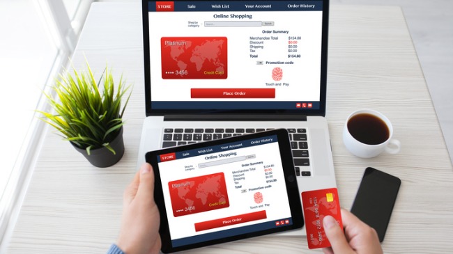
Want to make the mobile ecommerce customer experience even more extraordinary? Build a retail mobile app.
Mobile apps offer ecommerce brands benefits they couldn’t get with a website alone. Observing how a consumer interacts with your website and social media can definitely give you valuable insight. And website analytics tools can help you get a more comprehensive picture of a consumer’s interests and browsing behaviors.
Advantages of a Mobile App
But a mobile app can provide a substantially larger volume of data. According to comScore, 87% of the time shoppers spend on mobile is in apps. Plus, shoppers are almost always signed into an app, even when they’re not actively using it. On the flip side, shoppers often have to re-login when they visit a website.
So a customer could potentially browse through your site without logging in and you’ll have no way of knowing that site visitor is someone already in your database. But once they start using your app, you can immediately begin collecting data and expanding their customer profile. And with this data, you can offer more personalized experiences.
Another advantage mobile apps can offer is faster load time. Even if certain site elements are cached, a mobile site still has to download any new content from a server. And if a website takes longer than three seconds to load, over half of mobile site visitors will abandon it. But mobile apps are automatically updated when not in use. So as soon as a shopper opens the app, it’s ready to go with the latest content.
There’s an import caveat to mobile apps, however. Just because you have a mobile app, it doesn’t mean your customers will use it. Build a user interface (UI) that feels a bit more special than the web UI. Encourage customers to download your app by offering exclusive deals they can’t access elsewhere. Make the experience so engaging that your customers will default to the app rather than your site.
Pro Tip: It doesn’t matter if you have zero coding skills whatsoever. You can partner with companies like Shopgate and Sandbox Commerce who will create an app for you.
Customer Communication, Part I
You know who likes having questions they can’t find answers to? No one. Thus, the more available you are to your customers, the better.
Online retailers typically have five communication channels they can use:
- Live Chat
- Phone
- Self-Service Portal
- Social Media
It may not make sense for your brand to employ all five. But it’s in your best interest to offer shoppers as many ways to contact you as possible. Because every shopper has their preferred communication channel.
For example, Millennial consumers are particularly partial to live chat. And nearly 90% of Americans expect brands to have a self-service support portal. Over ⅓ of shoppers will head straight to Facebook or Twitter when they have a question. Customers with urgent questions may shy away from email since the average response time is 12 hours. And some shoppers would rather walk on hot coals than call your customer support line.
The moral of the story is this: if you can maintain the same level of customer service on every channel, then use as many as you can. Because offering consumers the ability to correspond with you on their preferred channel can inspire brand loyalty.
Most importantly, make sure the answers a shopper receives are always consistent, regardless of channel. A really quick way to frustrate a shopper is to provide conflicting information.
Pro Tip: Self-service portals are a great opportunity for smaller ecommerce merchants to assist consumers without having to be available 24/7. And what’s even better is that a regularly-updated customer portal can reduce the numbers of inquiries you receive.
Customer Communication, Part II

So that covers inbound communication. But what about outbound?
You have to keep customers in the loop about the status of their orders. And you need to be proactive about it; they shouldn’t have to reach out to you for updates.
The most efficient, most effective, most direct way to communicate with customers is email. Yes, a phone call has a more personal touch. But who’s going to answer their phone in the middle of working hours? And with the skyrocketing number of robocallers, it’s unlikely a customer will answer the phone at all if they don’t recognize the number.
But emails? Over 50% of working adults say they look at their personal inbox multiple times throughout the day. And the great thing about emails is they can be automated without coming across as robotic.
Triggered Emails
There are three triggered emails that should be sent each time a customer places an order:
Order Confirmation
You have received their order and are starting the fulfillment process. Order confirmation emails should contain details about what the customer purchased and the total cost of their order.
Shipment Confirmation
Your store has sent the package to the shipping carrier, and it is now in transit. Shipment confirmation emails should include tracking information so customers can see where their package is.
Delivery Confirmation
The carrier has reported the shipment as delivered. If possible, the delivery confirmation email should state the location of the package. For example, “in mailbox” or “left at front door”.
Remember: your commitment to the ecommerce customer experience isn’t over once the order ships. It’s not even over after the customer receives their order. Your loyalty to your customers must be evident at every step of the customer journey. And this includes post-checkout.
The Takeaway
Retailers who understand the power of the ecommerce customer experience are the ones who will continue to grow year after year. And retailers who are content with meeting the basic needs of their customers just won’t survive. Because the retail world is simply too competitive. If you want to be a brand with staying power, make sure your website, mobile experience, and communication strategy are all built with shoppers in mind. Ready to give ShipStation a try? Start Shipping Beyond Your Wildest Dreams™.
