Marketing Through Shipping Article #1 – Shipping Confirmation Email Tips

Congratulations! You have an easy-to-use, mobile-friendly, ecommerce website. With the work involved in keeping your site ready for sales, it’s easy to forget to put some time into your purchase email notifications.
Every time someone makes a sale, you probably have several automatic notifications that are set up in your system. These include order confirmations, shipping notifications, tracking notifications, account welcome notifications, and more.
While these may not seem exciting compared to promotional emails, the fact that transaction emails have click-through rates almost six times higher than other types of emails is an exciting statistic that might motivate you to take another look at these emails. Even better: open rates are often 100% or more (since they are often opened more than once).
If you’re ready to start working on your shipping notification email (and your other transaction emails), here’s how to get started:
Good – You can do this right now!
- Increase the size of your text font. Many studies have shown that conversions increase as your font size increases. Why? It’s just easier to read.
- Add the purchaser’s first name to the Subject Line and within the email. An Experian study showed that personalized emails had a 29% higher open rate and 41% unique click-through rate.
- Give thanks. We can never get thanked enough, right? All transaction emails should include some type of messaging thanking customers for their business. Shipping confirmations that did not include a “Thank you” had 35 percent lower click and transaction rates than those that included it, according to the Experian study mentioned above.
Better
- Show some personality. Most automated transaction emails contain standard (and let’s face it, boring language). Use your own words to make it fun and to create a stronger connection with your customer.
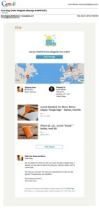
- Include tracking information. Your buyer wants to know when he/she will receive his/her package. Etsy’s shipping template includes this as a standard feature:
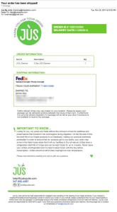
- Provide important reminders. Since shipping emails are usually opened, it’s a great time to remind buyers about how to use the product, and any other important information. Here is an example from ShipStation customer JusbyJulie:
Best
- Make the email pretty. Some notification templates allow you to add your logo (including ShipStation), but you might want to work with a graphic designer to create a standard template you can use for all of your transaction emails. Here’s an example from web design studio Hardage & Hardage:
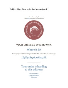
- Suggest additional products to buy. According to the Experian study, transactional emails that include cross-sell items have 20 percent higher transaction rates than those without. Think about how great it would be to increase your sales just by including a couple of product recommendations in your purchase emails.
- Include social media links. Not only does this give customers the ability to increase their connection with your company, but in the Experian study, transactional emails that included links to social media sites had 55 percent higher click rates than emails with no links.
Next Steps
In minutes, you can make quick changes to your shipping and other order emails that will increase your sales. Spending a little bit more time on the process, and possibly engaging a designer to help you, can reap even bigger benefits. Get started now with your shipping notification emails in ShipStation.

